I have some data as an example:
Description, X-Axis Interval, Y-Axis Value
Marbles, 1341, 242.39
Dice, 1500, 161.86
Cards, 4000, 109.29
Flour, 4050, 100.12
Cheese, 5061, 69.52
Mice , 6067, 69.34
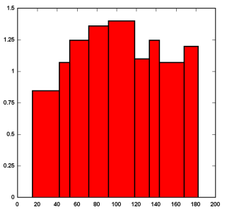
As you can see the interval is not equal. I am trying to make a Bar chart with the width proportional to the interval, like this:
I have checked the "Bars span intervals" in X but i'm not seeing it.
As a second question, when I finally get this to work, how can I label each bar with the Description, in the example above? Either together with the stats at the top of the bar, or below the X-axis interval scale??
Many thanks for your help,
Adrian.
