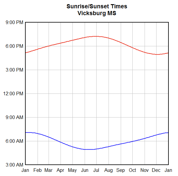
I'm evaluating DPLOT for use for plotting astronomical data - sunset, sunrise, astronomical twilight, etc. to use for planning astronomical imaging sessions.
DPlot almost plots what I want. I'm plotting sunset to sunrise times for the days of the months, with the x-axis the days of the months, and the Y-axis curves of sunset, begin astronomical twilight, end astronomical twilight, sunrise. On top of this I plot moonrise and moonset.
Dplot plots all this ok, but insists on putting noon down the middle of the graph. What I want down the middle of the graph is midnight, because I'm interested in what's going on at night, not at day.
I've tried inverting the Y axis, specifying the low and high extents. But I always end up with noon along the center of the Y axis.
Any suggestions?
If I can get this to work, you'll make a sale. If not, I'll have to find another program which will plot the way I wish.
Best Regards,
Arlo
Time Plotting
Moderator: DPlotAdmin
-
DPlotAdmin

- Posts: 2312
- Joined: Tue Jun 24, 2003 9:34 pm
- Location: Vicksburg, Mississippi
- Contact:
If I understand what you want then this should be fairly simple (though it could definitely stand some documentation somewhere in the Help file).
Starting with this:
if I add 24 to the sunrise times with Edit>Operate on Y, I get this:
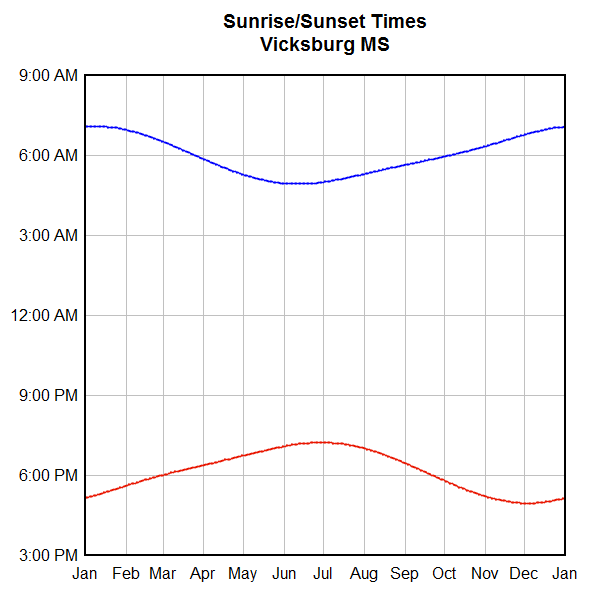
The clock times wrap, as I'd think you would want. One thing that might be confusing is forcing the extents to values other than the default. If you use Options>Extents/Intervals/Size then the Y extents for this graph are shown as 3PM to 9AM. If you leave those as is and click OK, the curves vanish because the scale is now from 3PM to the previous (rather than the next) 9AM. This is a sort of bug, but I'm not real sure what to do about it. Anyhow, to get around this problem just use numbers for the extents rather than times: 3PM to the next 9AM can be entered as 15 - 33.
Starting with this:
if I add 24 to the sunrise times with Edit>Operate on Y, I get this:
The clock times wrap, as I'd think you would want. One thing that might be confusing is forcing the extents to values other than the default. If you use Options>Extents/Intervals/Size then the Y extents for this graph are shown as 3PM to 9AM. If you leave those as is and click OK, the curves vanish because the scale is now from 3PM to the previous (rather than the next) 9AM. This is a sort of bug, but I'm not real sure what to do about it. Anyhow, to get around this problem just use numbers for the extents rather than times: 3PM to the next 9AM can be entered as 15 - 33.
Visualize Your Data
support@dplot.com
support@dplot.com
Can't Duplicate your results
David:
Thanks for the reply. Your second plot is EXACTLY what I am looking for. However, I was not able to duplicate your results. I'm just working on one month for now, not a whole year like your plot.
The initial plot of my data comes out with sunrise at the bottom (curve 1), sunset at the top (curve 2), and properly scaled - upside down from what I want.
When I do edit>options> operate on Y and add 24 to the value (Y=Y+24), I get a plot with sunrise at the top and sunset at the bottom, just like your second plot. However, the Y axis has every line labeled as 12:00:00 AM.
If you mouse over the values on the curves, they have the proper values, but the Y axis is obviously not labeled correctly.
If I then do Options>Extents/Intervals/Size, check Specify Extents, Input 15 and 33 for Y extents, I only get the sunrise curve (curve 1) down the center, every line on the Y axis labelled as 12:00:00 AM. No curve 2 (sunset) showing.
After typing in 15 and 33 in the extents, if you open the dialog again it shows the Y as 1/15/1900 12:00:00 AM and 2/2/1900 12:00:00 AM. If I change to Time of Day format, I can get the Y axis to plot 3PM to 9AM, but no curves are visible.
Here's the data file I'm working with.
Day Sunrise Sunset
01 07:56 16:58
02 07:56 16:58
03 07:56 16:59
04 07:56 17:00
05 07:56 17:01
06 07:56 17:02
07 07:56 17:03
08 07:55 17:04
09 07:55 17:06
10 07:55 17:07
11 07:55 17:08
12 07:54 17:09
13 07:54 17:10
14 07:53 17:11
15 07:53 17:13
16 07:52 17:14
17 07:52 17:15
18 07:51 17:16
19 07:51 17:17
20 07:50 17:19
21 07:49 17:20
22 07:48 17:21
23 07:48 17:23
24 07:47 17:24
25 07:46 17:25
26 07:45 17:27
27 07:44 17:28
28 07:43 17:29
29 07:42 17:31
30 07:41 17:32
31 07:40 17:33
Best Regards,
Arlo
-
DPlotAdmin
- Posts: 2312
- Joined: Tue Jun 24, 2003 9:34 pm
- Location: Vicksburg, Mississippi
- Contact:
If you copy/paste your data into DPlot or read a text file containing that data, it is interpreted as times with 0=midnight, 1=1AM, etc. And Time of Day number format should automatically be selected. "Calendar Date" number format, on the other hand, has whole number days: 1 hour = 0.041667. If you want to show both date and time on the Y axis you'll need to divide your Y values by 24 and add a date using Operate on Y with Y=Y+DATE(year,month,day)When I do edit>options> operate on Y and add 24 to the value (Y=Y+24), I get a plot with sunrise at the top and sunset at the bottom, just like your second plot. However, the Y axis has every line labeled as 12:00:00 AM.
But I'm guessing you want "Time of Day" number format, in which 1 hour = 1. (And that should be how your data is interpreted if you copy/paste it into DPlot or read a text file. If not please let me know exactly how you're getting your data into DPlot to start with.)
Whoops.
Open Extent/Intervals/Size again and use 15 and 33 for the Y extents. If that doesn't do what you want please let me know (but it worked as expected for me just now with your data.) The bad thing about this - and I really need to figure out a better way - is that every time you open Extents/Intervals/Size, you'll need to do that again before clicking OK, else the extents will be read as 3PM (15) and the previous 9AM (9), and your curves will go away when you click OK. Off the top of my head about all I can think of to do to get around this is initially present the extents as 3:00PM and 21:00AM, but I'm not sure that won't cause more problems than it solves.If I change to Time of Day format, I can get the Y axis to plot 3PM to 9AM, but no curves are visible.
Visualize Your Data
support@dplot.com
support@dplot.com
Still Have Blank Plot
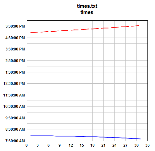
When I get to the end and have a Y axis labeled from 3:00:00 PM to 9:00:00 AM, I have no curves plotted.
I'm starting from an Excel spreadsheet, and using Add-in.
Here's my sequence:
1.Select 3 colums of data in the Excel spreadsheet
Day Sunrise Sunset
2. Add-In>DPlot
Resulting plot shows Y axis from 7:30:00 AM to 6:00:00 PM
Both curves visible
Mouse over values - they agree with input file
3. Edit>Operate on Y>
Operate on sunrise Y=Y*24
Resulting plot shows all Y ticks labeled as 12:00:00 AM
Both curves showing
Mouse over values on Curve 1 show they do not agree with input data
e.g. 1 10:24:00 PM , real value 7:56
15 9:12:00 PM, real value 7:54
31 4:00:00 PM, real value 7:40
Mouse over values in Curve 2 (sunset) agree with input data
4. Right click on a Y tick Label
Change format to Time of Day
Resulting plot shows Y axis from 12:00:00 AM to 8:00:00 AM
Both curves are visible
Mouse over values for Curve 1 (sunrise), values agree with input
Mouse over values for Curve 2 (sunset), values don't agree with input data
e.g. 1 12:42:25 AM, real value 16:58 (4:58 PM)
15 12:43:03 AM, real value 17:13
31 12:43:53 AM, real value 17:33
5. Options> Extens/Intervals/Size
Note: Extents are X 0 33
Y 12:00:00 AM 8:00:00 AM
Then check Specify Extents
Input 15 and 33 in Y low and Y high
click OK
Resulting plot shows Y from 3:00:00 PM to 9:00:00 AM, the range I want, but NO CURVES are visible.
Perhaps you could provide all of your keystrokes so I can duplicate your graph. Although it is a workaround, it is better than having to hand plot all of my data, and I have a lot of data to plot.
Thanks for your rapid replies.
Best Regards,
Arlo
-
DPlotAdmin
- Posts: 2312
- Joined: Tue Jun 24, 2003 9:34 pm
- Location: Vicksburg, Mississippi
- Contact:
Select both curves for this operation, or you'll have sunrise values from 0 to 24 and sunset times from 0 to 1.3. Edit>Operate on Y>
Operate on sunrise Y=Y*24
That's because "Date and Time" number format is in effect. As far as DPlot is concerned you now have a Y range of 24 days, not hours. Right click on the numbers along the Y axis and select "Time of Day"Resulting plot shows all Y ticks labeled as 12:00:00 AM
1. Here's your plot as it first appears after using the XYYY command in Excel:Perhaps you could provide all of your keystrokes...
If you right click on the times on the Y axis, you'll see that "Date and Time" is selected. No date is shown because the Excel Add-In made the decision to set the date format to <none> since all "dates" were 0. If you switch to "General" you'll see that your Y values are all between 0 and 1, which is how Excel stores times.
2. Select Edit>Operate on Y. Select "All curves", then click OK. In the "Y=" box enter Y*24, then click OK. All of the time values will be shown as midnight, but that's just a function of the number format used and the range in Y values (now 0 < y < 24). Right click on any time and select "Time of day". You'll now have a plot that looks like this (not much different):
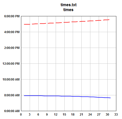
3. Select Edit>Operate on Y. This time select just the sunrise curve. Click OK. In the "Y=" box type Y+24. Click OK. Now you should have:
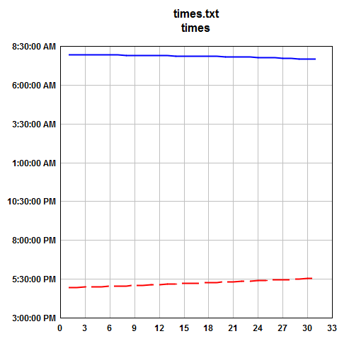
4. If you don't like the default extents shown here, select Options/Extents/Intervals/Size, check the "Specify Extents" box, and enter (for example) 15 and 33 for the Y extents.
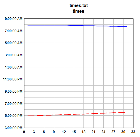
You probably don't want to show seconds on the Y axis. To change the time format right click on any time and select "More Number Format Options" at the bottom of the menu.
Let me know if you have any problems.
Visualize Your Data
support@dplot.com
support@dplot.com